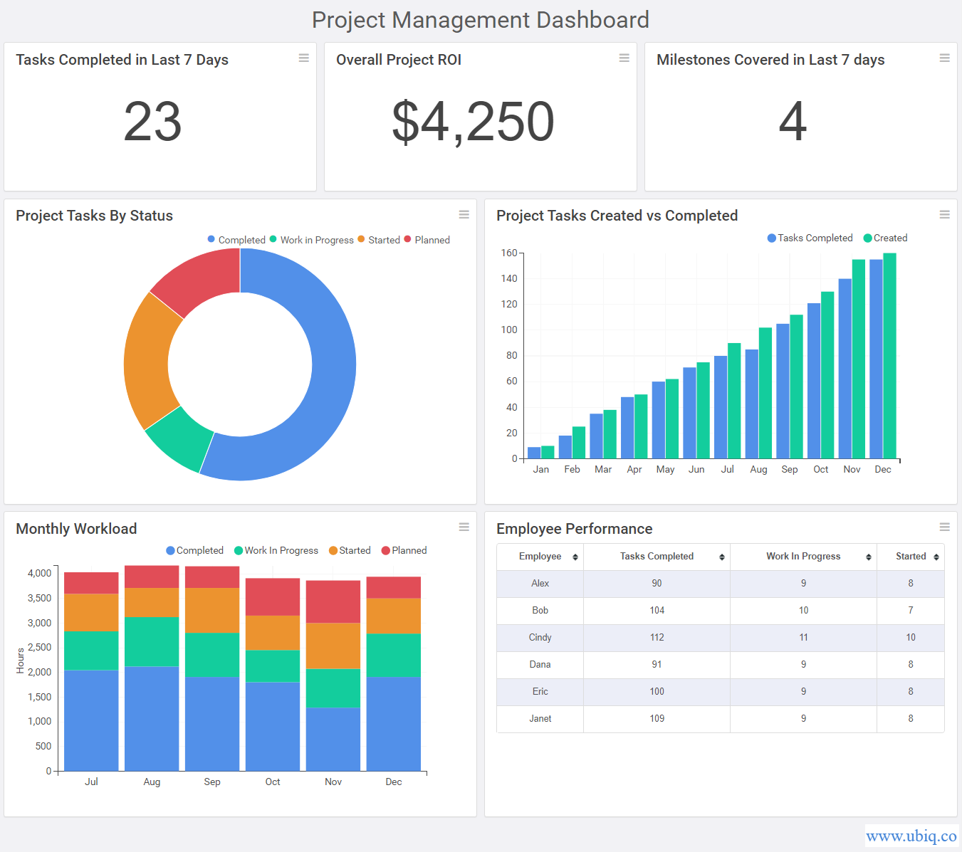
Charts and dashboards
Charts and dashboards
In today's data-driven world, charts and dashboards are essential tools for visualizing and analyzing data. They help businesses make informed decisions by presenting data in a way that is easy to understand and interpret. In this article, we will explore what charts and dashboards are, their benefits, and how they can be used to drive business success.
What are Charts and Dashboards?
A chart is a graphical representation of data, typically presented in the form of a graph, diagram, or other visual format. Charts can be used to display trends, relationships, and patterns in data, making it easier for users to understand complex information. Some common types of charts include line graphs, bar charts, pie charts, and scatter plots.
A dashboard is a visual display of data that provides users with a snapshot of key performance indicators (KPIs) and metrics. Dashboards typically consist of multiple charts and graphs, allowing users to quickly assess the overall health of their business and identify areas that require attention. Dashboards can be customized to display data from various sources and can be designed to be interactive, allowing users to drill down into specific metrics for further analysis.
Benefits of Charts and Dashboards
Charts and dashboards offer a range of benefits for businesses, including:
Improved decision-making: Charts and dashboards provide businesses with actionable insights that can inform decision-making at all levels of the organization. By presenting data in a way that is easy to understand, charts and dashboards help users identify trends, patterns, and outliers that may be missed in raw data.
Increased efficiency: By consolidating data from multiple sources into a single, easy-to-use interface, dashboards can save users time and increase efficiency. Users can quickly identify areas that require attention and take action to address issues before they become major problems.
Enhanced collaboration: Dashboards can be shared with teams and stakeholders, allowing everyone to view and analyze the same data. This can improve collaboration and promote a shared understanding of business performance across different departments and teams.
Improved data accuracy: By presenting data in a visual format, charts and dashboards make it easier to identify errors or inconsistencies in data. This can help businesses improve data accuracy and avoid making decisions based on incorrect or incomplete information.
Uses of Charts and Dashboards
Charts and dashboards can be used in a wide range of applications, including:
Sales and marketing: Dashboards can be used to track sales performance, monitor marketing campaigns, and identify opportunities for growth.
Finance: Dashboards can be used to track financial metrics such as revenue, expenses, and profitability, as well as monitor cash flow and other financial KPIs.
Operations: Dashboards can be used to track operational metrics such as inventory levels, production efficiency, and customer satisfaction.
Human resources: Dashboards can be used to track employee performance, monitor workforce demographics, and identify areas for employee development.
Conclusion
Charts and dashboards are essential tools for businesses looking to leverage their data to drive success. By providing a visual representation of key metrics and KPIs, charts and dashboards can help businesses make informed decisions, increase efficiency, and improve collaboration. Whether used for sales and marketing, finance, operations, or human resources, charts and dashboards are a valuable asset for any data-driven organization.

More Stories
Why is it important learn to work in programs?
Why is it important learn to work in programs? Learning how to use presentation software like PowerPoint can be important...
Today business lives on the Internet
Today business lives on the Internet The world has undergone a massive transformation over the last few decades, with the...
Staff training
Staff training Staff training is a critical aspect of any organization, as it directly impacts the productivity, growth, and success...
Program courses
Program courses Program courses refer to a set of academic courses that are designed to provide students with the necessary...
PowerPoint Magic
PowerPoint Magic PowerPoint is a software application used for creating presentations, and it has become an essential tool for individuals,...
Online courses are easy and convenient
Online courses are easy and convenient In recent years, online courses have become increasingly popular as a means of education....